Python, Pandas, Seaborn
Not all data is ready for prediction. Using Python and linear regression on world economic data, this project tests if the data fits the model. The goal? To learn how to check data quality before making forecasts. Because, good predictions start with the right data.

A well-organized Python code repository with various visualizations using simple sample data. This guide is a valuable resource for anyone looking to learn and implement data visualization techniques in Python, offering clear examples for both beginners and those seeking a useful reference.
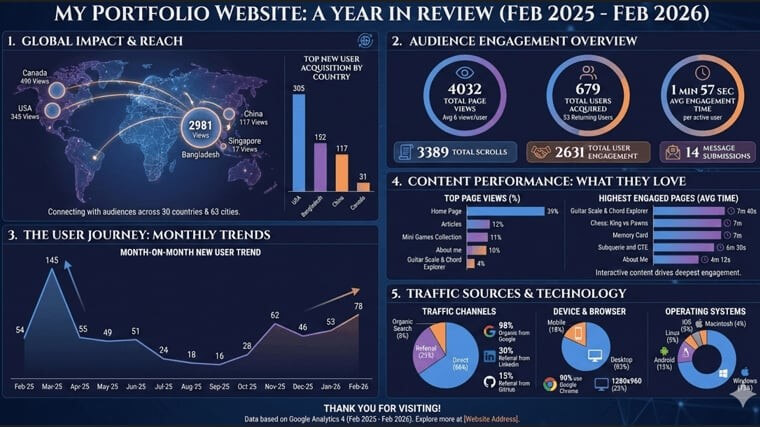
Beyond the dashboard, I used Google Analytics and HTML to show what actually happened during my portfolio website’s first year. I believe data should be easy to read, so I transformed technical metrics , raw data into a clear visual story of my progress, reflecting my thinking and my approach in analytics

For my university project, I built a Python-based system that predicts baseball game outcomes using historical data. By analyzing past performances, team stats, and trends, the model makes data-driven predictions about which team is more likely to win. It was a fun and challenging way to apply machine learning to real-world sports!
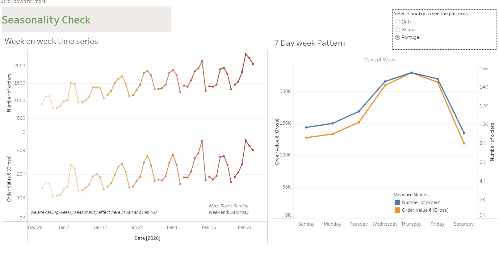
This dashboard visualizes trends and seasonal patterns in the data, helping to identify fluctuations over time and uncover key insights for better forecasting and decision-making.
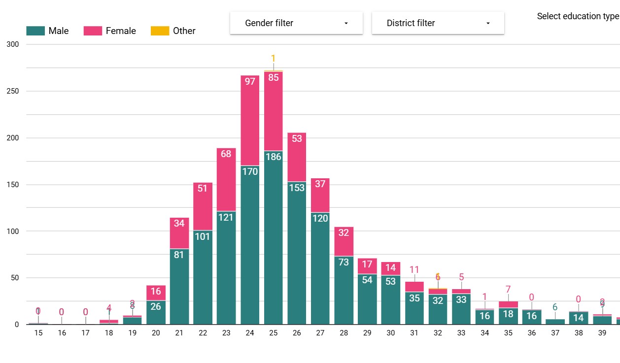
This dashboard visualizes survey data on education levels and career aspirations in Bangladesh, highlighting trends and preferences to inform decisions on education and professional development.
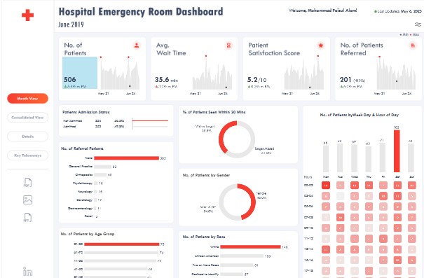
Tableau dashboard built on sample hospital data to visualize emergency room performance. Highlights patient volume, wait times, triage levels, and treatment outcomes. Enables quick insights for improving ER efficiency and patient care.
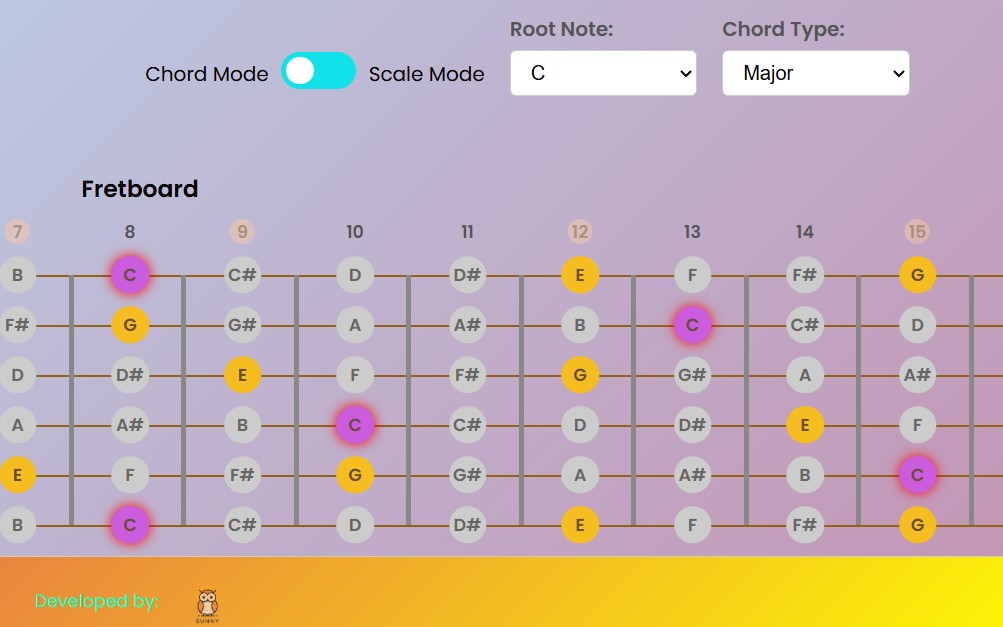
Struggling to learn guitar chords and scales? This tool makes it easy! Visualize the fretboard in real-time and take your playing to the next level. Perfect for beginners and pros alike!
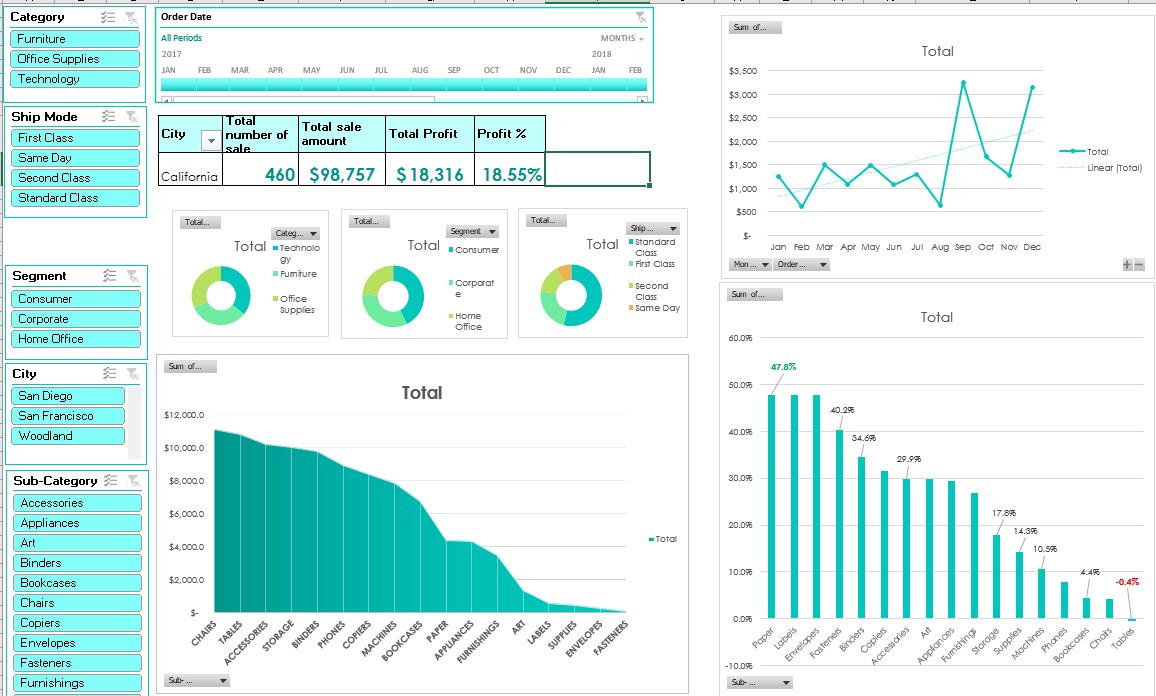
This interactive Excel report leverages Pivot Charts to transform raw data into actionable insights. Users can filter, sort, and analyze trends dynamically, making it easy to uncover patterns and key metrics. With an intuitive interface, this report is perfect for data-driven decision-making across various domains.
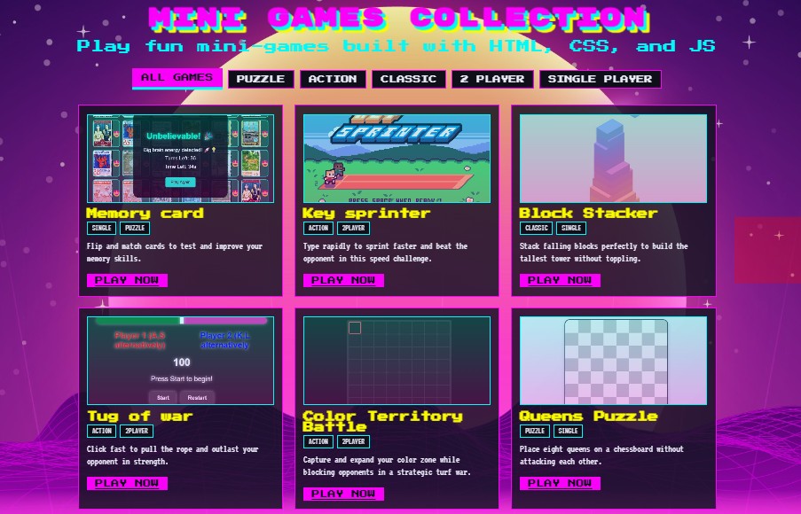
Dive into a world of fun with mini web games built using HTML, CSS and JavaScript! These lightweight, fast-loading games offer endless entertainment right in your browser. Whether it's puzzle, arcade challenge, or interactive experiments, each game is designed for quick play and maximum enjoyment- no downloads, just pure fun!. Laptop/PC is recommended for better experience.

This Power BI dashboard delivers an in-depth analysis of credit card transactions, focusing on key customer demographics. It highlights revenue breakdowns by gender, age groups etc. Interactive filters allow users to drill down into specific segments, uncover spending patterns, and make smarter, data-driven decisions for growth and risk management.